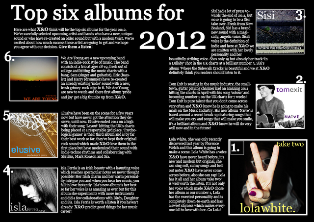
Here is my original double page spread I created for my music magazine, I didn't like this layout because it didn't seem conventional when I compared it to magazine double page spreads in magazines such as, Q or NME or the Rolling Stones. I researched into Q magazine double page spreads, and took ideas from their album pages and tried again and made another double page spread, which I think looks more conventional, compared to this try.

No comments:
Post a Comment