Wednesday, 22 February 2012

FINAL FRONT COVER, CONTENTS & DOUBLE PAGE SPREAD

This is my front cover I designed, I got my inspiration from music magazines such as Q and NME. I chose to photograph someone who would look like a conventional Indie-pop musician to make the theme of my magazine tie-in properly. I used sans-serif font for all of the text I wrote because I wanted the same text type throughout. But I alternated all of the text by using a variety of different font sizes, colours, outlines, gradients, to make the magazine conventional and attractive.


This is my final contents page, I wanted to use another photograph of the girl who was featured on the front cover so there was a recurring theme, and I added a quote she said to help promote the interview that was featured inside. I chose the colour yellow for the outline of the quote to match her glasses and I changed the font of her name 'Alice xo' to make it look like it had been hand-written.I wanted the word 'CONTENTS' to be big and bold so it was noticeable and be a big focus point. I number a few pages to show what would of been in the magazine and named a load of indie-pop bands and artists that were featured in the magazine, so if the artist on the front page wasn't what someone liked, a band featured within the magazine could interest them into buying the magazine.


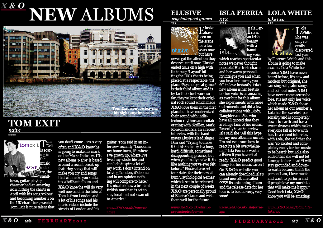
This is my final double page spread, I worked around the magazine Q which inspiried me in some aspects of my double page spread. I used the line tool on InDesign to give the double page spread a layout, by using the lines it gives the page a definitive layout, and enables the viewers eyes tofollow the lines across the page. All the photographs were taken by me and I made all of the album covers in photoshop using a text tool and a crop tool. I made up websites to make it look more real and like other conventional magazines, I also added a date and page numbers to give a better effect of it seeming real. 


Tuesday, 21 February 2012

old DPS

Here is my original double page spread I created for my music magazine, I didn't like this layout because it didn't seem conventional when I compared it to magazine double page spreads in magazines such as, Q or NME or the Rolling Stones. I researched into Q magazine double page spreads, and took ideas from their album pages and tried again and made another double page spread, which I think looks more conventional, compared to this try.

changes and improvements

After some deliberation I decided to completely change my double page spread and created a new one. I decided to change it because I didn't think it looked very conventional in comparison to music magazines. I looked through Q magazine as they have a lot of album features and got inspiration from That magazine and made a new double page spread.


Here is my new double page spread I created, I used the software InDesign to create a column layout which is very conventional in magazines. I had one of my albums as a main feature on one of the pages and had 3 other albums which I wrote about but in less detail on the other page. I also remembered to add a date, my magazine logo and page numbers, and I added lines to give the page more of a layout and a frame for readers to follow.


I also made a few changes to my front cover to give it a more conventional look. I added a date and changed my 'left third' by re-arranging the words and making the 'ALL NEW' bold and in a bigger font than the words bands and solo artists and made them words  a dark red so they would stand out against the white letters. And I changed the 2012 to the same colour as the 'Free Gig Tickets' so the colour scheme tied in better.

Thursday, 16 February 2012

ALBUM COVERS & ORIGINAL PHOTOGRAPHS


For my double page spread I decided to do an album chart page. I made all of the album covers myself and used all my own photographs for them. I created all of the albums on photoshop and created made-up artists and album names for the double page spread. I uploaded the original photographs I used for the albums and the pictures I used for the albums complete with the name and album title. I am really happy with the album covers I made and I am glad I decided to do my double page spread about an album chart instead of an interview because, it gave me more of a variety of things to write about and let me make-up an opinion of artists and bands and I think the double page 
spread turned out well. I used a variety of photos, for solo artists I used pictures with only one person in and for bands I used more landscape photographs and photos without people because I didn't have any photos that would look like a conventional band, and most of the time bands don't usually use photographs of themselves on their albums. 


Here are the final album covers I made on photoshop and used on my double page spread complete with artist names and album titles.

ORIGINAL PHOTOS


Here are my photographs I used for my front cover and my contents page. This is the original photo I took, I edited the photo on photoshop by boosting the contrast and brightness which made the photo more interesting and eye catching. I chose this photo for my main image for my front cover because it was a head on shot which catches readers attention because people are attracted to other peoples eyes. I took this photo at a high angle, looking down at her, this created an 'innocent' look  and although she isn't posing I think the photograph is very strong and powerful.


Here is the original photograph I captured and used for my contents page. I really liked this photo because she has a really nice, strong pose and the photo really catches your attention even though you can't see her eyes. The colour of the sunglasses brighten up the photo but I like that the photo is against a black background which is what I initially wanted. Having the yellow glasses and her red lips went well with the colour scheme I used on the contents page, and I was really happy with the result.

Monday, 30 January 2012

SCREEN SHOTS.

Here I took some screenshots of how I was working and what tools I was using to create my front cover, contents page and double page spread. Also, I have screenshot what the pages would of looked like if I had used different colours or a different layout for certain parts of the page.

For the screenshot above I changed the colour of all the text to white, I thought that having all the text in white made the page seem a bit boring and would probably become boring and uninteresting to read after a while.


In this shot I changed the alternating text to orange because i thought an orange theme might go well because some of my album photos had orange tones in them. I liked the orange colour scheme but I decided I liked another colour better.

I shot screened this to show a tool I was using, the tool is called 'swatches' and this allows me to changed the colour of the font and allowed me to have an outline around my text.  The software I was using was called InDesign.

In this shot I am showing the toolI used to create the gradient effect I used on the front cover and the contents page. 

In this shot I changed the colour of the text 'Contents' to red with a white outline to see if it made the page look better. I didn't really like the text in red, I thought it made the page look taccy and unconventional.

Here I decided to keep the text white and change the colour of the outline to red, but I didn't like it and I didn't think it fitted in well with the rest of the page.

And then I changed the colour of the font to yellow to see if a colour within the theme would go well as the colour for the text, but I thought having the word 'Contents' in yellow made the colour yellow too dominant on the page.

I changed the X&O to red but it wasn't as eye-catching and blended in with her headband and I didn't want the masthead blending in I wanted it to stand out.

Sunday, 29 January 2012

ANNOTATED DOUBLE PAGE SPREAD - Q

I annotated this feature from Q magazine because it is different to the feature in Kerrang magazine. In this magazine the feature on uses one photograph which is the background for the page, and it is a photo which would have been taken for this specific feature, unlike in the Kerrang article they used random photos of the artist.

However, both magazines use the usual conventions most magazines use such as, the drop capital, the text being in columns and body text. But, the article featured in Q uses sub-headings, has a headline and a uses graphic design.

I prefer the layout of this article, I like that the photograph is the background and the main focus of Florence takes up a whole page. Q has continued the red, white and black colour scheme into the feature, the red matches Florence's hair and the black matches her clothes which makes her stand out against the white/grey background.The image Q has used is Florence sitting down but she is posing in a strong position and creating many different angles with her arms and legs. Her clothes are contrasting against one another, she is wearing very short, black, leather shorts which are very prevocative, with a long sleeved, tutrle-neck, black jumper which is very subdude.